

Sunday 14 July 2013
Wednesday 10 July 2013

Wednesday 19 June 2013

Sunday 16 June 2013

Monday 10 June 2013


Thursday 6 June 2013

Tuesday 21 May 2013
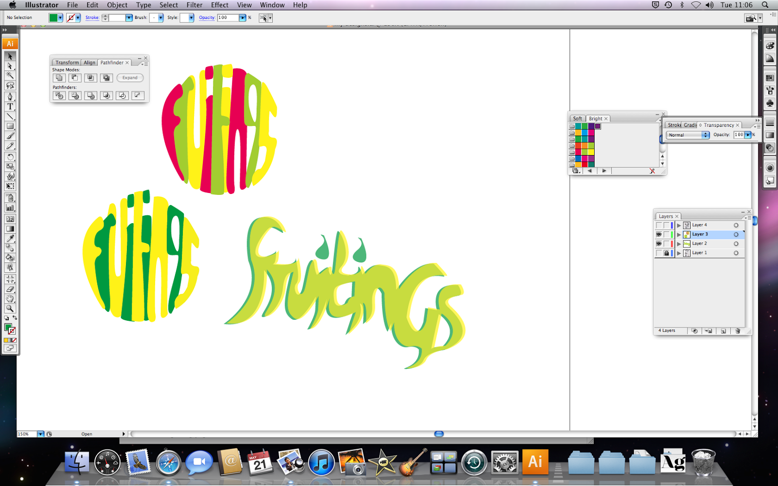
collage designs
 |
| these are some of the ideas i did uising magazines, newspapers and other scrap material |
balloon lettering
 |
| this is the balloon lettering i created to use as a company logo for my juice carton |


Wednesday 8 May 2013
my developed idea for a logo
 |
| this is my developed idea that i changed several times to make it better |


Thursday 18 April 2013

Wednesday 27 March 2013
painting of person
 |
| this is the painting of a person which we were told not to use smooth brush mark because we wanted the effect that you could tell you had painted it |
lemon painting
 |
| this is my painting of lemons that we did only using the colours- yellow, white and brown/purple |


magazine evaluation
What was the theme for the project ?
The theme for the project was to create a magazine about a topic of our choice. I choose to do a fashion magazine because its what I’m interested in and it’s also what I knew I could talk about, this also gave about how to layout my work and how to finally present it.
How have you developed your ideas? How did your work change throughout the project?
To start with I did a plan on paper and from that I created magazines around that one piece. I also used other magazines to give me inspiration and ideas to help layout my work. However, half way through the project I was able to take some of my own photos for the magazine model and so I changed it to one of my photos, which meant I had to completely change my design and layout of my cover and basically starting a different magazine cover. As my ideas developed my work changed and things were placed in different place until I had finally finished the magazine covers.
How many photographs did you take? Do you think you should have done more or less?
I took quite a few photos with me and my friend and from the photos I took I narrowed it down to about 3. I also used a contact sheet which enabled me to sort which photos I wanted to use. I think it was about 30 photos that we took but some of them were blurred or we were pulling stupid faces in them.
What artists or designers have you looked at to help and inspire you?
I used different styles/types of magazines to inspire me. Magazines like vogue, bliss and a few other well known magazines gave me ideas as to what to put and write on my own magazine. I also goggled some cover models on the internet to see how they were positioned and how the lighting around the room was used.
What materials, tools and techniques did these artists use? Think about lighting and wardrobe?
The artists used Photoshop to edit the model and probably make the surrounding background lighter. They also used different fonts to make the magazine text stand out more. The colours of the magazines also contrasted in with the font colours. The colours were mainly vibrant and bright colours which stood out. Some of the artists used white as the background colour so then the cover model and text was the main feature of the magazine cover.
How have your skills developed during the project? Photography and Photoshop
My skills have developed most on Photoshop as, I have learned new techniques such as how the change the transparency of object and how to import fonts on to my work from dafont and how to change the height, width and how to change the leading of the fonts. For photography I have learned that you need some sort of light source to get a good photograph and that to take a photo it is always best to have a plain background so you can cut it out and shape it better
Are there any aspects of your studies that you wish you had explored further?
The only thing which I’d wished that I had explored further was the photography side to the project because even though we took our own photos for the magazine we didn't really get told what was good from our photography and what was bad.
How have you used formal elements such as line, tone, colour and shape?
I used shapes such as circles on my work to create a sticker affect which stood out on the magazine. On one of my magazines i used a shaded background around the back of some of my text, i also used outlining tool to highlight around some of the outsides of some of my texts. the colours on my magazine tied in with the colours on the cover model because the font colours came from the model because I wanted the magazine to be similar.
What materials did you use, and why? Did they work successfully?
I used Photoshop to create my magazine because its easy to use and there are loads of effects in which i used to make my magazines better and more professional. They did work successfully because my magazines turned out really well except for a few mistakes which I accidentally made.
What meaning and messages did you want to convey and were you successful?
The meaning of my magazine was to interest girls/women to read the magazine because the magazine's subject was to do with fashion and accessories and what girls/women want to know in the world today. I guess you could say that the message of both the magazines is that they stand out so i want people "in real life" to buy them because certain writing
stands out more than other writing, so it might draw the audience to go pick it up and read it.
Are you happy with your final piece? Are there any elements you like in particular?
I am very happy with both of my magazine covers as final piece and to be honest i didnt think would have turned out as well as they did. My favourite elements of the magazines- on the first one, the way the layout worked well as a whole and how the fonts tied in well with the subject. The second one, they way the writing "pretty in pink" looks nice on the magazine and how it stands out because it’s a different font from the others.
Is there anything you would change? Why?
I don’t think I would change anything to the first magazine because its my favourite one and i just think it looks good as it is and if i changed it i would probably ruin it. However, on my second magazine there are a few things which i would change because now i look back at it there are a few mistakes and problems which need changing, for example- the distance between each letter in the masthead " voules" is a different distance to the "vous" and looks odd for being that. Also the leading between some of the words needs to be changed so there closer together because at the moment there too far apart.
Friday 22 March 2013


Tuesday 5 March 2013


Wednesday 6 February 2013
pencil draft
 |
| this is my pencil draft which i made to give me inspiration toward doing my final design |
work in progress 2nd magazine


work in progress 1st magazine


 |
| this is my first magazine which i designed. i print screened my shots throughout the project and finally print screened my final magazine cover |
Tuesday 5 February 2013
contact sheet


Wednesday 9 January 2013

Wednesday 12 December 2012

Tuesday 11 December 2012
Project Evaluation
What was the theme for the project?
The theme for the project was wolves and little red riding hood, for this we made a book cover for Roald Dahl's "ghastly and grizzly, the gruesome tales of Roald Dahl"How have you developed your ideas? How did your work change through the project?I have developed my ideas through a range of different Medias, such as charcoal, gouache and many more materials. My work changed throughout the project as my drawings improved and my ideas for my book cover evolved and I thought about what I could change to make it better. Such as when i did the pencil drawing of the wolf, i was not to pleased with it so i changed it completely and re-designed it.
How much reference material did you find? Do you think you should have done more or less?I found some of reference material, of pictures of wolves, log cabins, red riding hood, and other things. I do think I could have used more material references but then again I did have enough to complete my project. Although i have got some material from the internet i have also drew pictures from the internet but i have not put the actual reference material in my book.
What artists or designers have you looked at to help and inspire you?
As a whole I only looked at one artist which was Scott Campbell, whose work was inspiring and I did a double page of his work in our sketch book. The pictures that i painted were of wolves witches,gorillas and other weird designs. Other than that I got inspiration from drawings and pictures that I printed of the internet.
What materials, tools and techniques did these artists use?The material used in the Scott Campbell copy was gouache. To do this I used a black colour, watered down to create different shades and make it more effective. The artist painted his pictures always with a black outline around the edge of the images, and the way in which he none of the paint was not perfect because some of the areas were left white.
How have your skills developed during the project?During the project my skills have developed because my drawing has become more accurate and better. Also I have learnt new skills such as how to use Photoshop and image capture, which I have never used before until now.i have also learnt how to use other tools and techniques. For example i had never heard or used gouache before until we used it for the artist copy.
Are there any aspects of your studies that you wish you had explored further?
I wished that I had explored the ways in which wolves move and present themselves, as I would have liked to go and see some real life wolves to see how they live and react in their environment. I also would have like to research the actual book by Roald Dahl and see what pictures/images they used to show the poem and see what there views on the drawings were.
How have you used formal elements such as line, tone, colour and shape?I have used tone in some of my work such as the Scott Campbell copies, and the drawing of the wolf. I have also used shape in my work as many of my drawings are at the right proportion and look representational. I didn’t use much colour in my work as black and white were more compatible with the project because if the work is black and white it makes it easier to work with on Photoshop.
What materials did you use, and why? Did they work successfully?
Throughout the project I used a range of materials such as graphite pencil, biro, ink, chalk and fineliner. I used these because they were easy and made my work stand out more. Some of the pieces worked better than others as I found the charcoal was my favourite because it was messy and easy to change. Whereas when I did the printing I found it hard to work with because you couldn’t change it after you printed it and also that there was no tone to the print, and so it was just black and white.
What meaning and messages did you want to convey and were you successful?
The meaning of my book cover was to create an evil looking wolf to show on the front, and so it was bigger than everything else on the page. I also tried to create the story using just pictures of red riding hood and the wolf and other little things to fill up the space. I also aimed at making the book cover quite sinister and making not so much a happy mood.
Are you happy with your final piece? Are there any elements you like in particular?Yes I and very happy with my final piece although I can now see things that maybe need adjusting a little. My favourite bit is the front cover writing as it stands out really well and is different from everyone else’s. I also like the fact that the no one else has done the layout similar to me.
Is there anything you would change? Why?
Even though I like my work the way it is, if I had the chance to change my work I would start all over again to see whether it would look better presented in a different form. Also I don’t like my pencil drawing of the wolf because it doesn’t look right and doesn’t look anything like how I wanted it to.
To be honest I am very happy with my final book cover, and it is all that I wanted and designed it to be.


Subscribe to:
Posts (Atom)